Week one: from an empty repo to a combat wheel
A 5E character builder, a tap-to-roll table sheet and three versions of a combat screen in seven days. Here's the rule I set on day one, and how the turn became a wheel.
Seven days ago the repo for my new app was empty. Seventy-three merged pull requests later, every one of them built with Opus, it’s a guided character builder for 5E, a table-side sheet you tap to roll from, and a combat mode we designed three times in two days. All twelve classes from the 5E System Reference Document are in, levels 1 to 20, and that part was done by day three.
That’s way too much for one post, so this one sticks to the two stories that shaped everything else: a rule I set on day one, and how a turn of combat turned into a wheel.
Day one: save the choices, never the numbers
A 5E character sheet is a pile of derived numbers. Your Athletics bonus comes from your Strength, your proficiency bonus, your class, maybe your background, maybe a feat. Store those numbers and every rules fix turns into a data migration, and every screen has to be careful not to let you build something illegal.
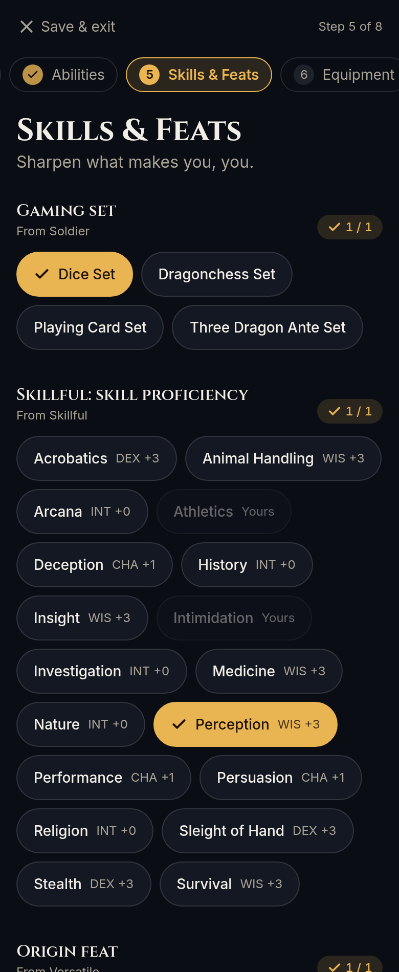
So on day one I decided a character gets saved as the list of choices the player made, and nothing else. A pure rules engine re-derives the whole sheet from those choices every time. The builder doesn’t decide what to ask you next. It asks the engine which questions are still open and only shows those.
That one call is what makes the builder hard to get wrong. Validation lives in the engine, not in the screens. Every option is a card or chip that says what it gives you, and Next stays locked until the step is valid, with the reason right there: “pick 1 more”, or “You already have Athletics”.
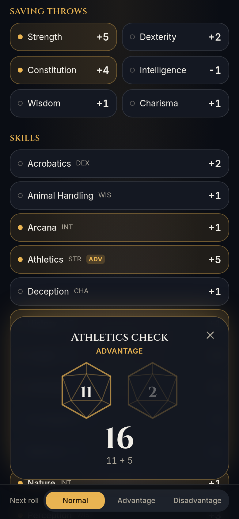
The same engine powers everything after the builder. Finish a character and you land on a table sheet where tapping any ability, saving throw, skill or initiative rolls it, with advantage and disadvantage applied for you. Attack and damage rolls, HP tracking with death saves, and short rests followed the same day. The engine’s test suite went from 53 to 81 tests on day one alone.
One small detail I really like: HP is stored as damage taken, not current HP. Level up and your max HP goes up, but the wounds you’re carrying stay put, because that’s what actually happened.
Nothing derived is ever saved, so a character also survives rule fixes. If we get a number wrong and fix it, every saved character is right the next time it opens.
I also had to pick a platform. Flutter was tempting for a game-like feel. The honest comparison was that Flutter’s 2D edge is small for an app like this and shows up mostly on low-end Android phones. The web gives you a sheet you can open on a laptop at the table, or send to your DM as a link, and an offline web app for free. I’d also already shipped Byte on Svelte, which gave us a template to start from. So I went with Svelte, web first, wrapped for iOS and Android.
Combat, three ways in two days
Version one: a very good menu
The first combat view tracked your Action, Bonus Action and Reaction each turn and listed everything you could do with them. It worked. It also read like a restaurant menu, not a turn.
I had four notes on it. The action bar belongs at the bottom. The “next roll” footer takes up a lot of room for something you rarely touch. Cards for things the turn guide already offers shouldn’t show up twice. And the common stuff, attacking and casting, deserves a bigger stage than “Study”. Most of all, clicking Attack should lead somewhere: to your next attack, or to the things that ride along with one. It shouldn’t just leave every other action sitting there.
Version two: a turn with a direction
So the turn bar moved to the bottom, the footer shrank to a small Adv/Dis toggle, duplicate cards hide during combat, and attacks and spells became big tiles. Taking the Attack action now locks the turn into a sequence, “Attack 2 of 3”, with Next attack and Done attacking.
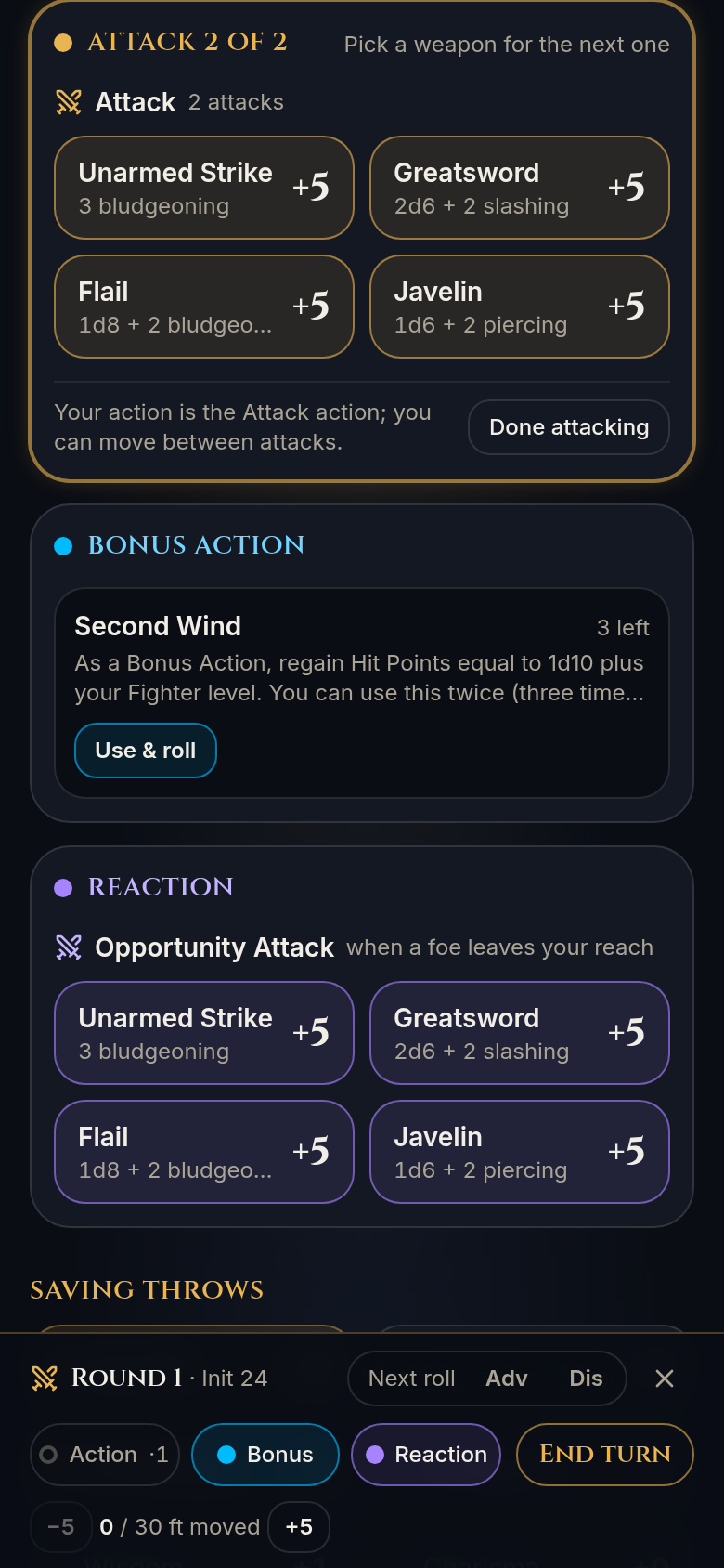
The sequence also surfaces the things the rules tie to an attack: the extra attack from a Light weapon (and Nick, which folds that extra attack into the Attack action itself), and once-per-turn riders like Sneak Attack.
Version three: the wheel
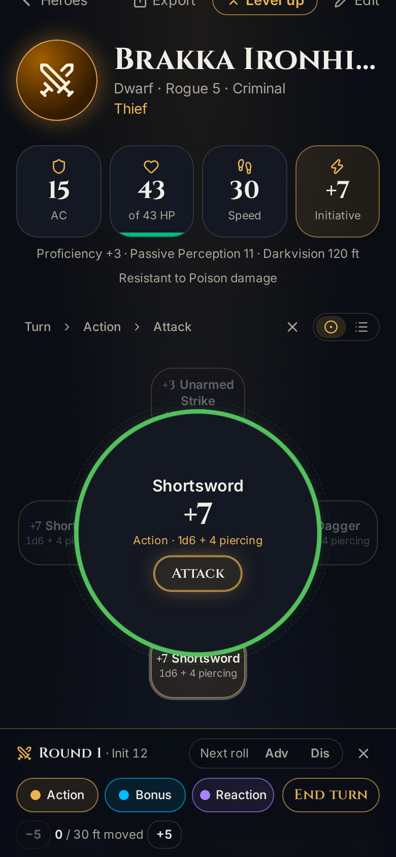
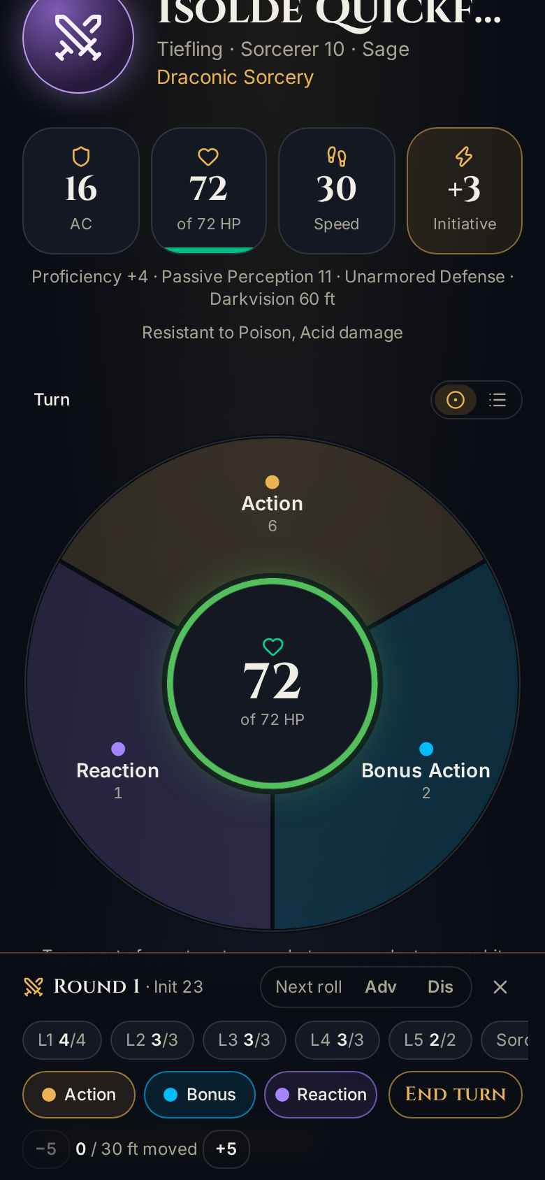
Then I pulled an old project off the shelf: an infinite radial menu I built in Unity years ago, designed for combat action menus in games, especially on mobile. My pitch was simple: put HP in a circle in the middle, with Action, Bonus Action and Reaction buttons around it. Plus a green-to-red glow around the HP, for a little extra pizzazz.
It fit better than I expected, because a turn was already a tree: Action, Bonus Action or Reaction, then attacks, spells or features, then the thing that actually does it. That meant the wheel could be a new view over the same engine state, not a second combat system to keep in sync. Day one’s rule paid off again. Pick something and it moves to the center with its details and a Use button.
Rectangles around a circle never look right
The first try put three rounded buttons at 12, 4 and 8 o’clock. It looked lopsided whichever way we nudged it, because a rectangle is wider than it is tall, and no amount of padding fixes that. The fix was a different shape: three equal 120° segments.
Then I pushed it further. I wanted the gaps on the top layer gone, with diamond-shaped buttons fanning out from the center like the old Simon game, and a mechanical animation for changing layers, like a sci-fi door sliding open and shut.
So Opus built touching wedges with dark seams, and a door. When you move between layers, the old panels twist into the center, the HP circle gives a little clunk, and the new panels twist out one by one with a slight overshoot. With reduced motion turned on, the layer just swaps.
A few more things the round shape made us think about:
- Don’t move buttons under a thumb. The wheel puts the options you use most at 12 o’clock, but it only re-sorts when combat starts. Anything that appears or disappears mid-turn lands at the bottom, so nothing you were about to tap slides away.
- Long spell lists on a round menu. About eight labeled options fit around a ring on a phone. Rings that would be crowded split into another layer (Spells, then by level), and only what still doesn’t fit spins, with arrows. Most rings never need to.
- A bug we only found by re-checking. After the wheel shipped, we re-ran a Rogue’s turn and rolled damage before closing the result. The wheel marked the Nick extra attack “Action used”, which it wasn’t. Fixed in the same change.
Our first outside tester
This week our Android tester went through the builder and sent 17 numbered notes, plus three more comments. All but two were handled in a single change.
The biggest one: picking a species, class or background auto-advanced right past the tab that explained what it gives you, so nobody ever saw it. Now tapping a card opens what it gives you right under it, with a Choose button, and the separate tab is gone. The steps also now go Class, Background, Species, which is the order the SRD 5.2 itself uses.
Point buy used to start from the standard array, so you had to lower every score before you could spend anything. Now every score starts at 8 with 27 points, and you can’t move on until you’ve spent them all. Rolled stats got a roll counter, with a little ribbing as the number climbs, because the tester asked for one.
The review step now labels every feature, skill and tool with where it came from:
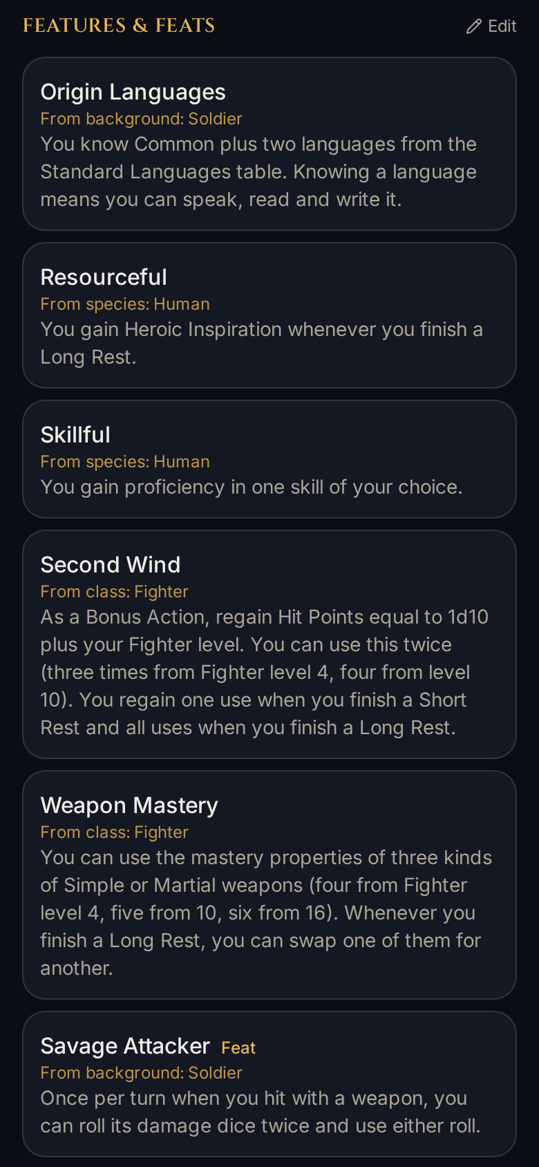
The notes also showed us where labels could say more. Multiclass requirement badges now read “to multiclass out” and “to multiclass in”, and Weapon Mastery explains itself right where you pick it.
One request I especially liked was an equipment store. The SRD has equipment, and new characters start with gold to buy their own gear, so I wanted it in 1.0. It shipped the same day.
Also in the pile
The rest of the week, in one breath: the remaining species and backgrounds, 3D dice, a UX pass for every class, phone notch safe areas, groundwork for the native iOS and Android builds, a motion and focus pass, previews of the bonus when you pick a skill, icons on the builder cards, equipping weapons and an inventory, Metamagic when casting, a strict rules mode, an in-app feedback button, a fix for crit damage, and effect chips in combat.
That’s week one. The Bark Blog will be back next week with what came next.